This article is about how to change button colors
*🖼️ You will find screenshots for each step customized to the specific template you've chosen.
⭐️ My templates are fully designed and ready to use. You can customize them completely or simply add your text and images, duplicate sections, and make as few changes as you'd like.
⚠️ Important: This template includes a special feature created by custom CSS, which adds a unique hover effect to the Primary and Secondary on-page buttons. These effects are already installed and ready to use.
🔮 Every time you add one of the Buttons (Primary or Secondary) the effect will automatically be applied.
✨ Hover effects are a fabulous way to add a little extra magic to any website! ✨ Buttons are clickable calls to action that should be as unique as the rest of your website!
If you don't want this to appear in your site, you can just simply delete it out or opt for the Tertiary Button, which does not include this feature.
*The Tertiary Button, when you hover over it, it lightens up. That’s the standard for Squarespace.
💡 I will walk you through this in the CSS - Template Feature - Tutorial Harmony
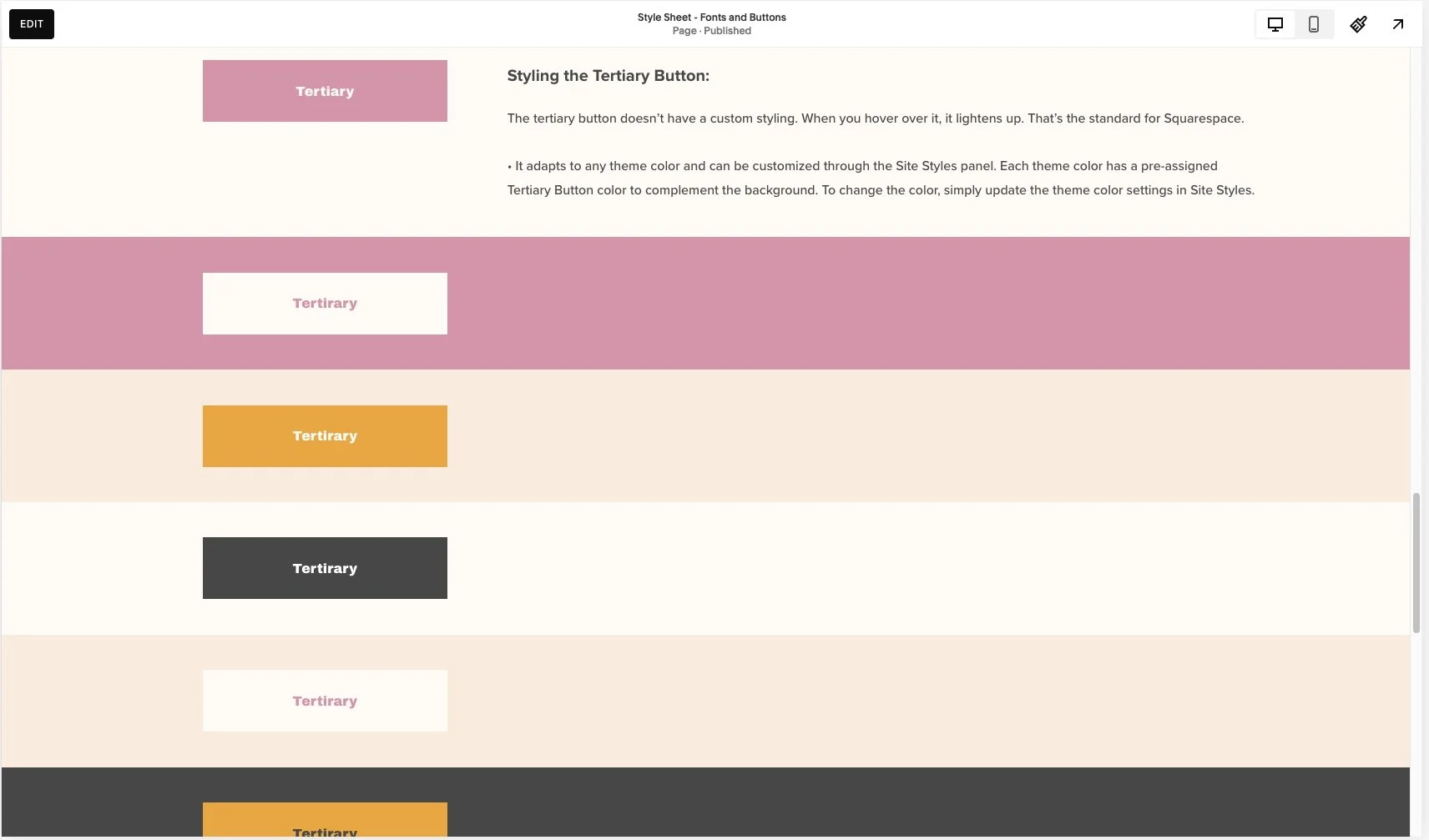
🔸 In this tutorial, we'll use the Tertiary Button as an example to show how to change button colors.
• On the “Style Sheet – Fonts and Buttons” page of your site, scroll down until you see the buttons displayed for each of the Harmony Template’s color themes.
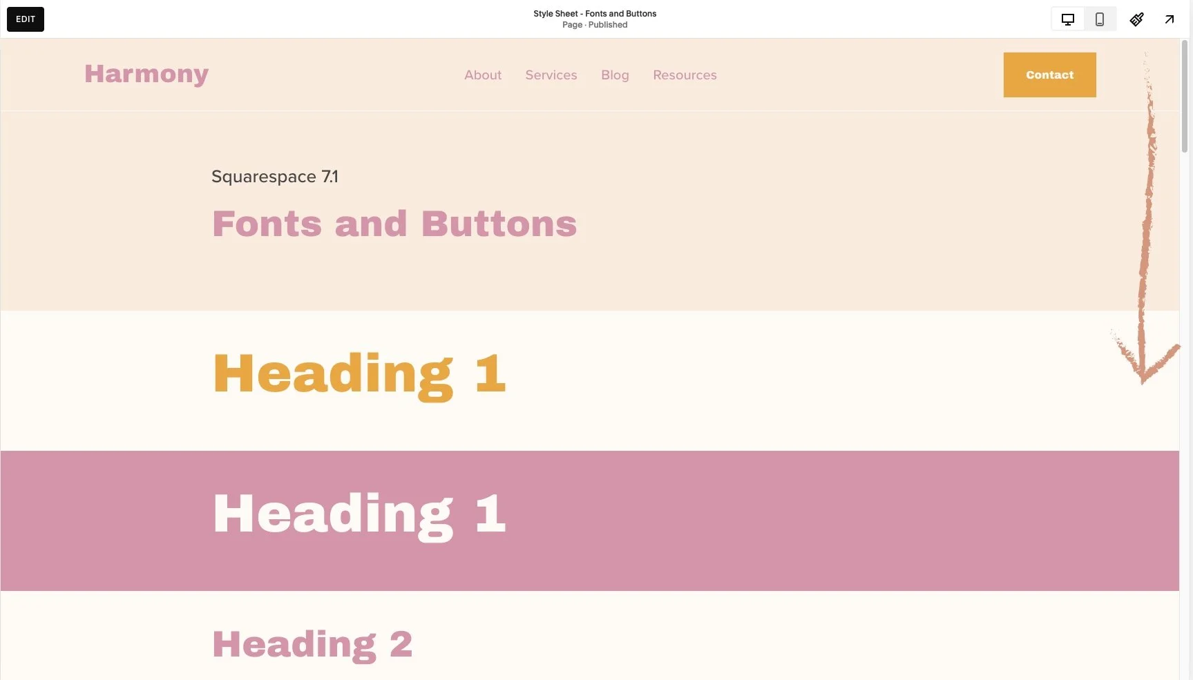
🔸 You have all of these sections lined out for each one of the Harmony Template’s Color Themes on a Page named “Style Sheet - Fonts and Buttons” located on the Not Linked section. You can use it and easily see what the content of your site will look like when you make changes on the Colors menu.
•💡Changes made in Site Styles apply across your entire site. If you update a theme, the changes will automatically apply to all sections that have that theme assigned.
If you're using a Style Sheet page or any other page to experiment with different colors, keep in mind that you can always revert back to the previous color.
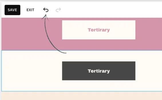
To do this, you can use the undo and redo arrows in the top-left corner of the editor. These work for most changes in the page editor, including blocks, sections, section styles, and site styles.
If you click Save in the top-left corner while editing, you can still undo or redo changes within that session. However, once you Exit the page, your editing session ends, and any changes you made can no longer be undone or redone.
Go to edit mode.
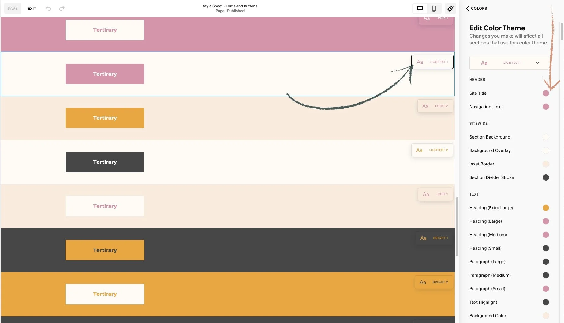
Click on the paint brush icon on the top right-hand side. And you will reach a menu.
Click on Colors. This is where you have the Color Palette and Color Themes.
• You will notice something very different about the page you are on, Squarespace is going to tell what Color Theme has been assigned to each section on the specific page.
Scroll through your page preview and review the section theme labels on each section.
👀 Be sure to identify the color theme you're working with. When you navigate to Colors in Site Styles, you'll see small preview pop up appear in the upper right corner of each section. These indicate the color theme applied to different sections of your page.

• Let’s take a look at this Lightest 1 Color Theme as an example:
Click on Lightest 1 in the list of color themes. You will reach a list of options.
You’re going to see a list of all different types of content available in your Squarespace website that you can change the color of.
• To change the color of the button of this section (Lightest 1):
1. Click again on Lightest 1 in the list of color themes.
Now you can see a list of items got narrowed down to what actually is in this specific section.
The Tertiary Button Background is set to pink, and the Tertiary Button Text color is off-white.
You can also click any block within a section, and Squarespace will filter the options to show only those relevant to what's on the section.
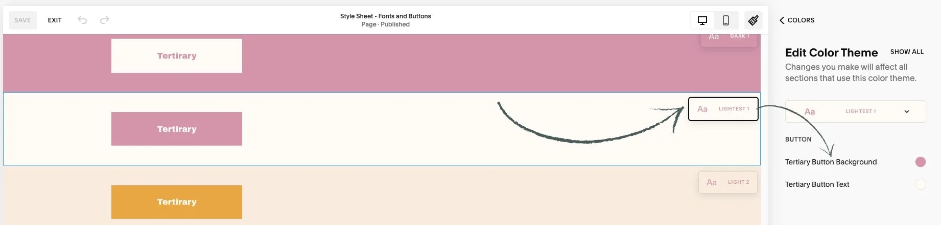
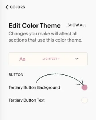
• Let’s change the Tertiary Button Background color for the Lightest 1 theme.
⭐️ Keep in mind that the settings you choose in Site Styles for each color theme will apply wherever that theme is used. So, every time you add a Tertiary Button within the Lightest 1 theme, it will always appear with the assigned styling.
Click the circle next to where it says Tertiary Button Background and the Color Palette will pop up.
• Here is where you choose the color.

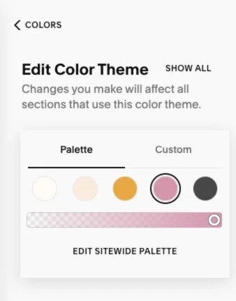
The background is set to pink from the palette, but you can choose a different color.
If you want the black from the last circle:
Click on it.

• To move this background color back to the color it was set before, you can:
Follow the same steps to open the color options and select the original color from the palette.
You can use the undo and redo arrows in the top-left corner of the editor. These work for most changes in the page editor, including blocks, sections, section styles, and site styles.
🔸 If you click Save in the top-left corner while editing the page, you can still undo or redo changes within that session.
👀 However, once you Exit the page, your editing session ends, and any changes you made can no longer be undone or redone.
🔹 In this Squarespace template, the Tertiary Button appears on the Services, Service Info, and Events pages, as well as in the Site Header.
💡 Remember that changes made in Site Styles apply across your entire site.
If you update the Tertiary Button in the Light 1, Light 2, and Darkest 2 themes, the change will be reflected on your Services, Service Info, and Events pages, as well as in the Site Header.
Each button type (Primary, Secondary, and Tertiary) has its own settings for background and text colors within each color theme. If you choose to remove the hover effect code for the Primary and Secondary buttons, you can update their colors the same way you did for the Tertiary button.
🔸 On a page called 'Style Sheet - Fonts and Buttons' located under the 'Not Linked' section, I’ve outlined the Tertiary button in various themes. You can use this page to preview how the buttons will look with different theme styles, and easily add more sections to experiment with changes in the Colors menu.
