This article is about how to change buttons colors.
*🖼️ You will find screenshots for each step customized to the specific template you've chosen.
⭐️ My templates are fully designed and ready to use. You can customize them completely or simply add your text and images, duplicate sections, and make as few changes as you'd like.
• From the “Style Sheet - Tutorial” page on your site:
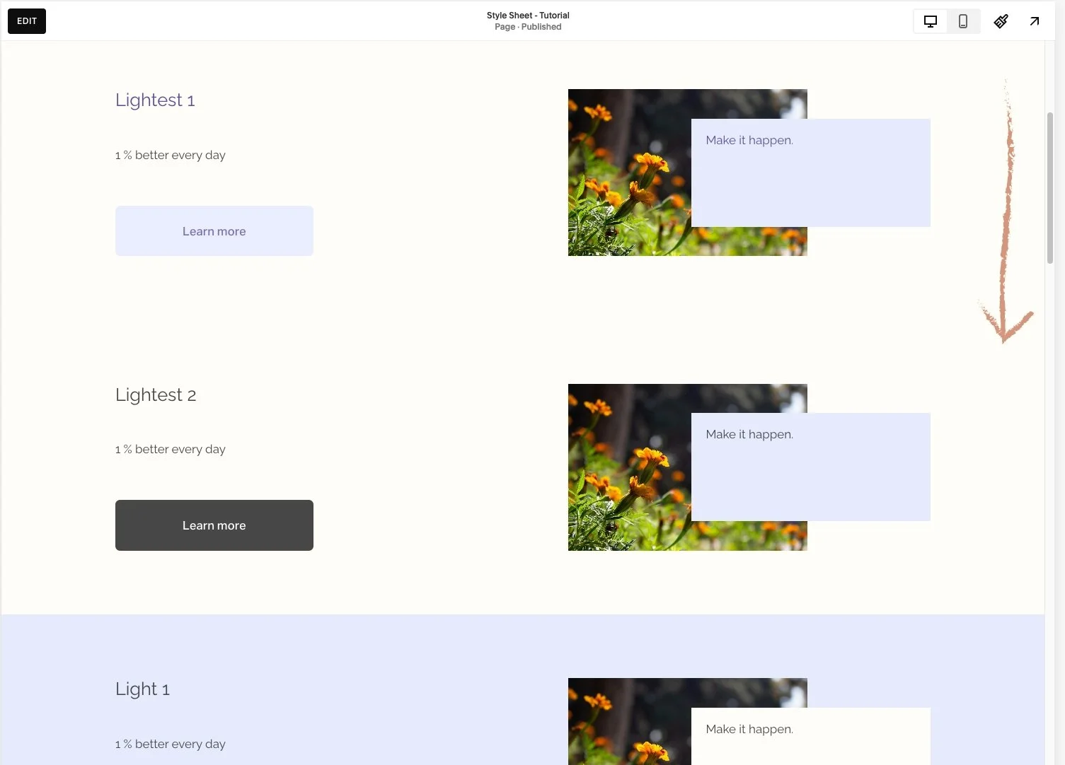
🔸 I’ll be using the “Style Sheet – Tutorial” page, located in the Not Linked section, as an example in this tutorial. This page showcases the Wise Academy color themes and you can use it and easily see what the content of your site will look like when you make changes on the Colors menu.
•💡Changes made in Site Styles apply across your entire site. If you update a theme, the changes will automatically apply to all sections that have that theme assigned.
If you're using a Style Sheet page or any other page to experiment with different colors, keep in mind that you can always revert back to the previous color.
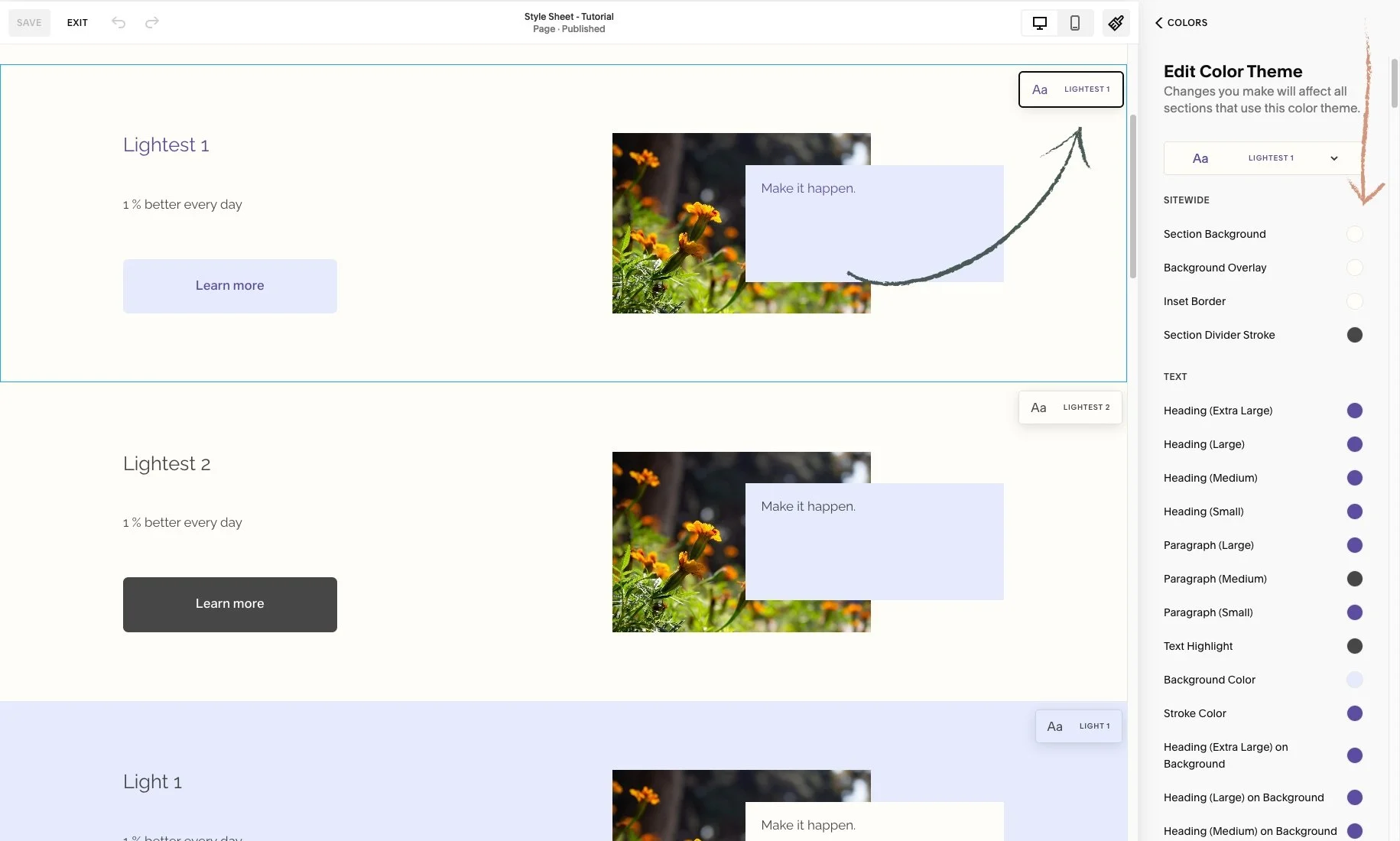
To do this, you can use the undo and redo arrows in the top-left corner of the editor. These work for most changes in the page editor, including blocks, sections, section styles, and site styles.
If you click Save in the top-left corner while editing, you can still undo or redo changes within that session. However, once you Exit the page, your editing session ends, and any changes you made can no longer be undone or redone.
Go to edit mode.
Click on the paint brush icon on the top right-hand side. And you will reach a menu.
Click on Colors. This is where you have the Color Palette and Color Themes.
• You will notice something very different about the page you are on, Squarespace is going to tell what Color Theme has been assigned to each section on the specific page.
Scroll through your page preview and review the section theme labels on each section.
👀 Be sure to identify the color theme you're working with. When you navigate to Colors in Site Styles, you'll see small preview pop up appear in the upper right corner of each section. These indicate the color theme applied to different sections of your page.


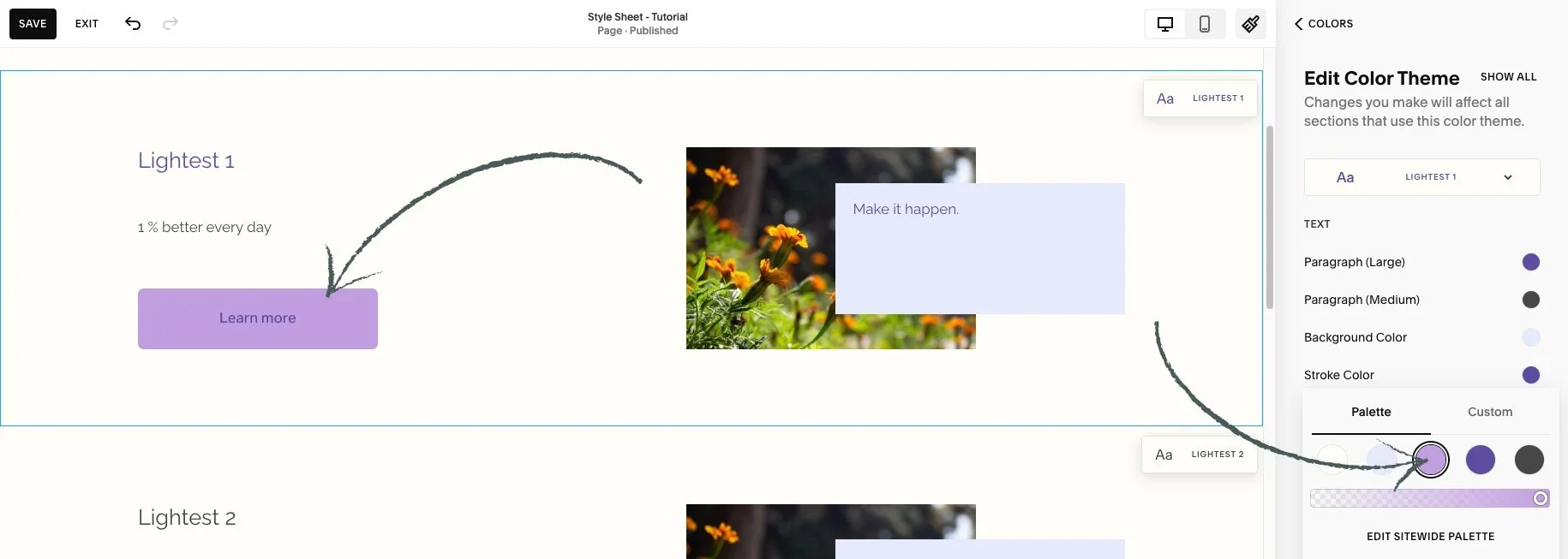
• Let’s take a look at this Lightest 1 Color Theme as an example:
Click on Lightest 1 in the list of color themes. You will reach a list of options.
You’re going to see a list of all different types of content available in your Squarespace website that you can change the color of.
• To change the color of the button of this section (Lightest 1):
1. Click again on Lightest 1 in the list of color themes.
Now you can see a list of items got narrowed down to what actually is in this specific section.
🟣 The Primary Button Background is set to light purple, and the Primary Button Text color is dark purple.
You can also click any block within a section, and Squarespace will filter the options to show only those relevant to what's on section.

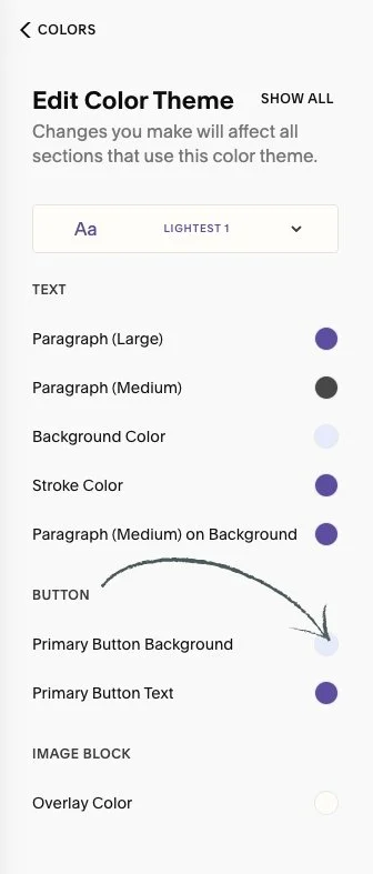
• Let’s change the Primary Button Background color for the Lightest 1 theme.
⭐️ Keep in mind that the settings you choose in Site Styles for each color theme will apply wherever that theme is used. So, every time you add a Primary Button within the Lightest 1 theme, it will always appear with the assigned styling.
Click the circle next to where it says Primary Button Background and the Color Palette will pop up.
• Here is where you choose the color.
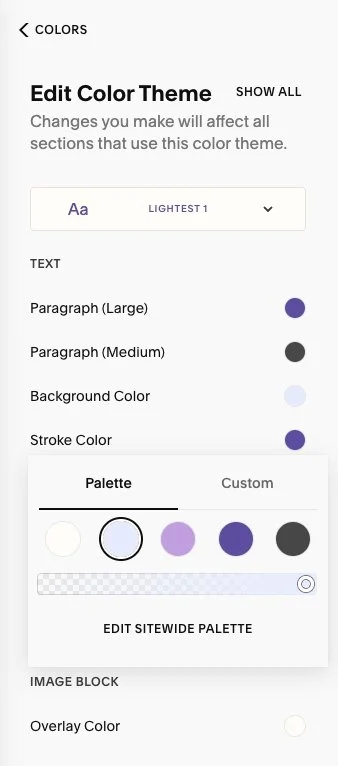
The background is set to light purple from the palette, but you can choose a different color.
If you want the purple from the middle circle:
Select the new color.
• To move this background color back to the color it was set before, you can:
Follow the same steps to open the color options and select the original color from the palette.
You can use the undo and redo arrows in the top-left corner of the editor. These work for most changes in the page editor, including blocks, sections, section styles, and site styles.
🔸 If you click Save in the top-left corner while editing the page, you can still undo or redo changes within that session.
👀 However, once you Exit the page, your editing session ends, and any changes you made can no longer be undone or redone.

🔹 In this Squarespace template, the Primary Button is used on all pages except for the first section of the homepage, which uses the Lightest 1 theme and features the Tertiary Button.

💡 Remember that changes made in Site Styles apply across your entire site.
If you update the Primary Button in any color theme, that change will be reflected on all pages in the template.
If you update the Tertiary Button in the Lightest 1 theme, the change will be reflected on your homepage.
The Secondary Button hasn’t been used in this template, so you can use and update it without affecting the existing design.
Each button type (Primary, Secondary, and Tertiary) has its own settings for background and text colors within each color theme.
🔸 On a page called 'Style Sheet - Fonts and Buttons' located under the 'Not Linked' section, I’ve outlined the Primary, Secondary, and Tertiary buttons in various themes. You can use this page to preview how the buttons will look with different theme styles, and easily add more sections to experiment with changes in the Colors menu.

