This article is about the special feature display in your Harmony template: button hover effects.
Custom CSS - Special Feature - Button Hover Effects
CSS stands for cascading style sheet; a code language that tells a computer browser how to display the style of a site.
*🖼️ You will find screenshots for each step customized to the specific template you've chosen.
This template includes a special feature created by custom CSS, which adds a unique hover effect to the Primary and Secondary on-page buttons. These effects are already installed and ready to use.
🔮 Every time you add one of the Buttons (Primary or Secondary) the effect will automatically be applied.
✨ Hover effects are a fabulous way to add a little extra magic to any website! ✨ Buttons are clickable calls to action that should be as unique as the rest of your website!
If you don't want this to appear in your site, you can just simply delete it out or opt for the Tertiary Button, which does not include this feature.
I’ll show you how to do it.
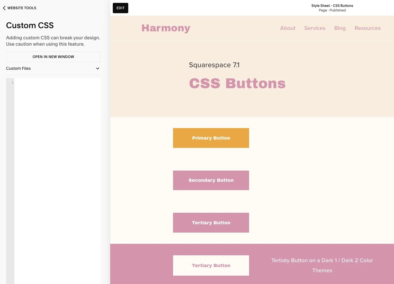
*The Tertiary Button, when you hover over it, it lightens up. That’s the standard for Squarespace.
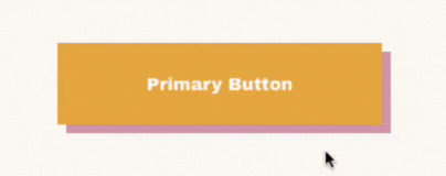
• Here you have a Primary Button and we are going to use it for an example:
• When you hover over the button, the pink shadow moves inward, replacing the background color, making the entire button pink, pretty cool right?
Let’s talk about how this works:
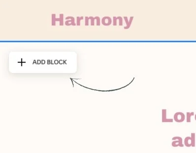
Navigate to Website and click Pages.
Scroll all the way down to Custom Code and click on it.
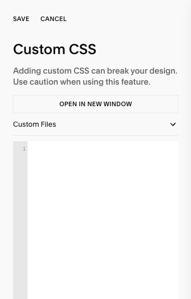
Then click on Custom CSS.
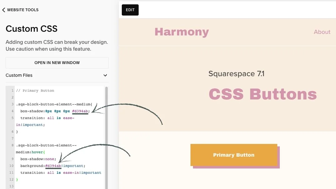
• This is where this code goes:
• Here is the code I added to make this happen:
🔸 Primary Button:
.sqs-block-button-element--medium{
box-shadow:8px 8px 0px #d394ab;
transition: all 1s ease-in!important;
}
.sqs-block-button-element--medium:hover{
box-shadow:none;
background:#d394ab!important;
transition: all 1s ease-in!important
}
🔸 Secondary Button:
.sqs-block-button-element--large{
box-shadow:8px 8px 0px #e9a843;
transition: all 1s ease-in!important; }
.sqs-block-button-element--large:hover{
box-shadow:none;
background:#e9a843!important;
transition: all 1s ease-in!important
}
👀 You can find the codes for this effect on the Style Sheet - CSS Buttons Page located in the Not Linked section of the pages panel.
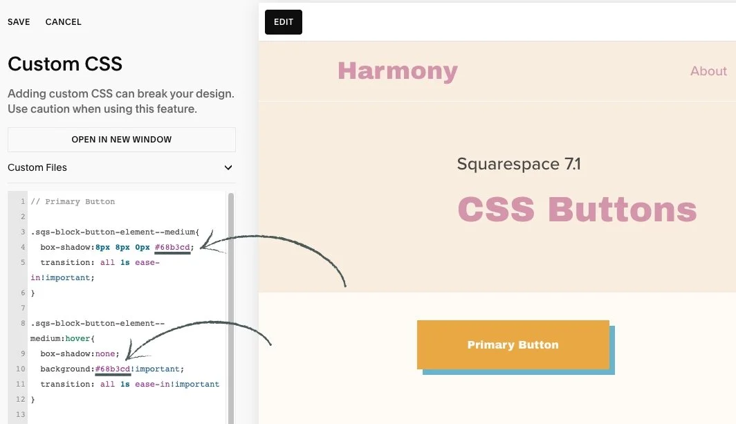
• If you want to switch up these colors and add your own brand colors, you can add your Hex Color Code where it says HERE:
🔸 Primary Button:
.sqs-block-button-element--medium{
box-shadow:8px 8px 0px #HERE;
transition: all 1s ease-in!important;
}
.sqs-block-button-element--medium:hover{
box-shadow:none;
background:#HERE!important;
transition: all 1s ease-in!important
}
🔸 Secondary Button:
.sqs-block-button-element--large{
box-shadow:8px 8px 0px #HERE;
transition: all 1s ease-in!important; }
.sqs-block-button-element--large:hover{
box-shadow:none;
background:#HERE!important;
transition: all 1s ease-in!important
}
🎨 Copy the code, replace Hex Color Code with your own, and paste the updated code into the designated CSS area.
🔹 Let’s use a blue color as an example: #68b3cd.
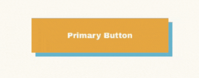
🔹 You can do the same with the Seconday Button if you want to switch up the colors.
🌈 Play with the colors from your palette!
👀 Don’t worry if you accidentally delete the original code. You can always find it saved on the Style Sheet - CSS Buttons Page located in the Not Linked section of the pages panel. page. Just copy and paste it back in to keep experimenting and learning with confidence.
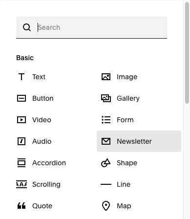
• This template also includes another special feature created by custom CSS:
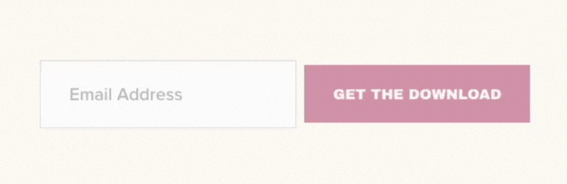
💌 The Newsletter Button changes color when hovered over.
✨ It’s already installed and ready to use every time you add a Newsletter Block.

• Here is the code I added to make this happen:
🔸Newsletter Button:
.newsletter-form-button:hover{
background: #f8ede0!important;
color:#d394ab!important;
opacity:1!important
}

⭐️ If you happen to delete the Custom CSS, no worries. You can find the codes on the Style Sheet - CSS Buttons Page located in the Not Linked section of the pages panel.
• If you want to switch up these colors and add your own brand colors, you can add your Hex Color Code where it says HERE:
🔸 Newsletter Button:
.newsletter-form-button:hover{
background: #HERE!important;
color:#HERE!important;
opacity:1!important
}
🎨 Copy the code, replace Hex Color Code with your own, and paste the updated code into the designated CSS area.
• If you don't want this to appear in your site, you can just simply delete it out:
Navigate to Website and click Pages.
Scroll all the way down to Website Tools.
Then click on Custom CSS.
Delete the codes and click save.
• The Buttons will display in the color you've set in the Site Styles menu and will lighten on hover, as is standard in Squarespace.
💌 If you happen to delete the Custom CSS, no worries. You can find the codes on the Style Sheet - CSS Buttons Page located in the Not Linked section of the pages panel.