This article is about the special feature display in your Wise Academy template: gradient effect on headings.
Custom CSS - Special Feature - Gradient on Headings
CSS stands for cascading style sheet; a code language that tells a computer browser how to display the style of a site.
*🖼️ You will find screenshots for each step customized to the specific template you've chosen.
This template includes a special feature created by custom CSS, which adds a unique hover effect to Headings. It’s already installed and ready to use.
🔮 Every time you use one of the Headings (H1, H2, H3, and H4) the effect will automatically be applied.
✨ Gradients are a fabulous way to add a little extra magic to any website! ✨ These gradients are easy to use and will give your projects a professional look.
If you don't want this to appear in your site, you can just simply delete it out. I’ll show you how to do it.
• Here I have an H1 text that says Heading 1 and I’m going to use it for an example:
• When you hover over it with your cursor it switches, it flips the colors there, pretty cool right?
Let’s talk about how this works:
Navigate to Website and click Pages.
Scroll all the way down to Custom Code and click on it.
Then click on Custom CSS.
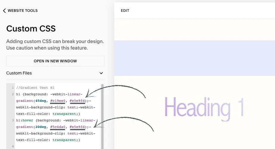
• This is where this code goes:
• Here is the code I added to make this happen:
h1 {background: -webkit-linear-gradient(45deg, #c19ee0, #e5e9fd);-webkit-background-clip: text;-webkit-text-fill-color: transparent;}
h1:hover {background: -webkit-linear-gradient(20deg, #5c4da0, #e5e9fd);-webkit-background-clip: text;-webkit-text-fill-color: transparent;}
👀 You can find the codes for this effect on the Style Sheet - CSS Headings Page located in the Not Linked section of the pages panel.
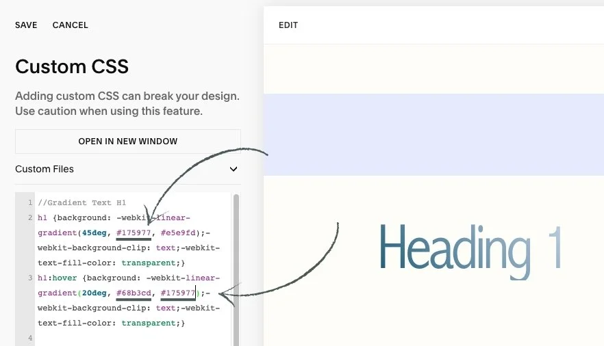
• If you want to switch up these colors and add your own brand colors, you can add your Hex Color Code where it says HERE:
h1 {background: -webkit-linear-gradient(45deg, #HERE, #HERE);-webkit-background-clip: text;-webkit-text-fill-color: transparent;}
h1:hover {background: -webkit-linear-gradient(20deg, #HERE, #HERE);-webkit-background-clip: text;-webkit-text-fill-color: transparent;}
🎨 Copy the code, replace Hex Color Code with your own, and paste the updated code into the designated CSS area.

🔹 Let’s use shades of blue as an example: #175977 and we will have that transition into #68b3cd.

You can do the same with H2, H3 AND H4 if you want to switch up the colors.
🌈 Play with the colors from your palette!
Don’t worry if you accidentally delete the original code. You can always find it saved on the Style Sheet - CSS Headings Page located in the Not Linked section of the pages panel. page. Just copy and paste it back in to keep experimenting and learning with confidence.
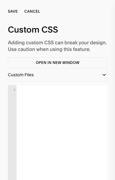
• If you don't want this to appear in your site, you can just simply delete it out:
Navigate to Website and click Pages.
Scroll all the way down to Website Tools.
Then click on Custom CSS.
Delete the codes and click save.
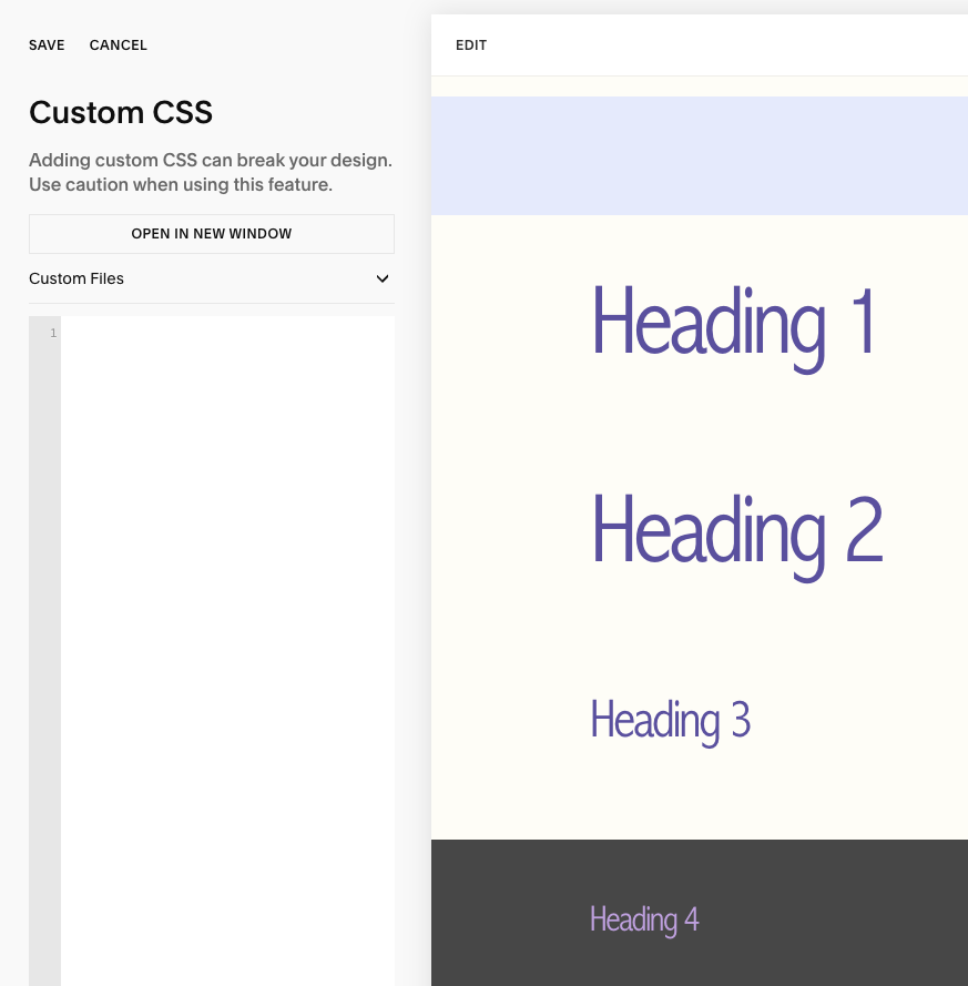
• Headings will then display with the color set in your color palette without the gradient effect.
💌 If you happen to delete the Custom CSS, no worries. You can find the codes on the Style Sheet - CSS Headings Page located in the Not Linked section of the pages panel.
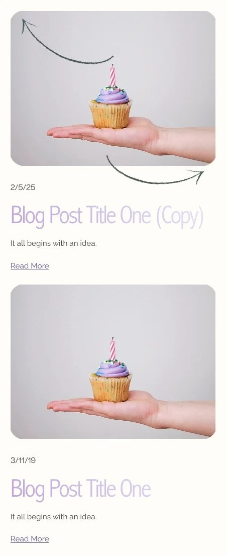
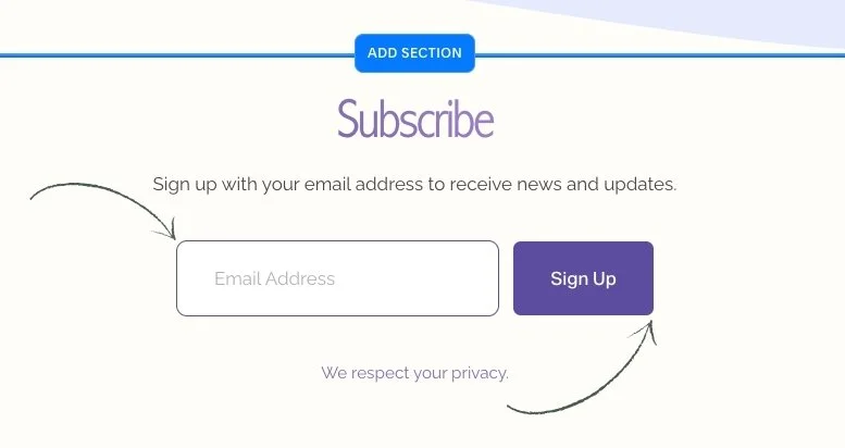
• This template also includes a special feature created by custom CSS which adds:
Round corners to the Blog Thumbnail Image. It’s already installed and ready to use every time you duplicate a Blog Post.
Curve the corners of the Newsletter Block email input & give it a border. It’s already installed and ready to use every time you add a Newsletter Block.
⭐️ If you happen to delete the Custom CSS, no worries. You can find the codes on the Style Sheet - CSS Headings Page located in the Not Linked section of the pages panel.